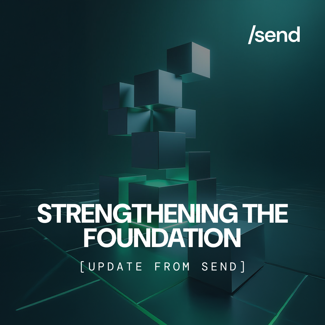
We’re thrilled to announce the unveiling of Send’s new brand identity, a significant evolution in our brand’s journey. This update includes not just our logo and color palette, but also a comprehensive visual strategy that aligns with our mission and audience.

The Essence of Send’s Wordmark
- Simplicity and Accessibility: The /send wordmark, crafted in DM Sans, symbolizes our commitment to seamless financial interactions and an inclusive user experience. It reflects the straightforwardness of a command-line interface.
- Adaptive and Versatile: Our wordmark adapts to various formats – use ‘/send’ in larger settings, ‘/s’ in medium spaces, and ‘/’ in compact areas. This ensures brand consistency and visual impact across all platforms.

The Typeface: DM Sans
DM Sans is our choice for its modern, clean design, rounded corners, and legibility across devices, making it ideal for digital interfaces. Being a free font, it also aligns with our democratic and pragmatic values.


A Bold Color Palette: Neon Green
- Youthful and Digital-First: Neon green, as our primary color, is chosen to resonate with a digital-first audience, symbolizing growth, positivity, and energy.
- Symbolism & Nostalgia: The neon green color reflects multiple facets of our brand – it’s the color of money (finance), sustainability (green initiatives), and embodies a forward-thinking mindset. Additionally, this choice is a throwback to the monochrome computer screens of the past, where the command line, a symbol of digital innovation and simplicity, originated. It encapsulates our vision for a green, positive future, while paying homage to the roots of digital technology.

Visual/Image Strategy: Capturing the Essence of Send
- Visual Storytelling: Our visual strategy is centered around storytelling that speaks to our tech-savvy, entrepreneurial audience in emerging markets. We use imagery that is bold, innovative, and speaks to the spirit of decentralization and democratization in finance.
- Dynamic and Inclusive Imagery: The visuals are designed to be dynamic and inclusive, reflecting the diverse, global community we serve. Our imagery will showcase the real-life impact of Send in various communities, emphasizing how our solutions empower individuals and businesses.
- Digital-first Approach: Consistent with our brand, the imagery will have a digital-first, contemporary feel, using graphics and animations that resonate with our audience’s tech-oriented mindset.

Innovative Collaboration: The Wolfgang Project
Our new identity stems from our collaboration with The Wolfgang Project, an Amsterdam-based leader in creative innovation. Together, we’re pushing the boundaries in Web3 and AI, redefining the future of digital identity.